INTRODUCTION

I reimagined the iconic Ressence Type 3 for the digital age—designed and developed for smartwatches while preserving its mechanical charm, balancing aesthetics with functionality, and enhancing digital usability.

Project type:

Smartwatch

My contribution:

Visual design, User testing, Experience Design, Development

Tools:

Figma, WatchFaceStudio

Timeline:

120 hrs

NORMAL

ALWAYS—ON

STORY BEHIND THIS PROJECT

I’ve always loved watches. As a kid, every trip to the beach in Chennai ended the same way—me, standing in front of a tiny shop, convincing my parents to buy me another one. And every time, I’d walk away with a new favorite strapped to my wrist.


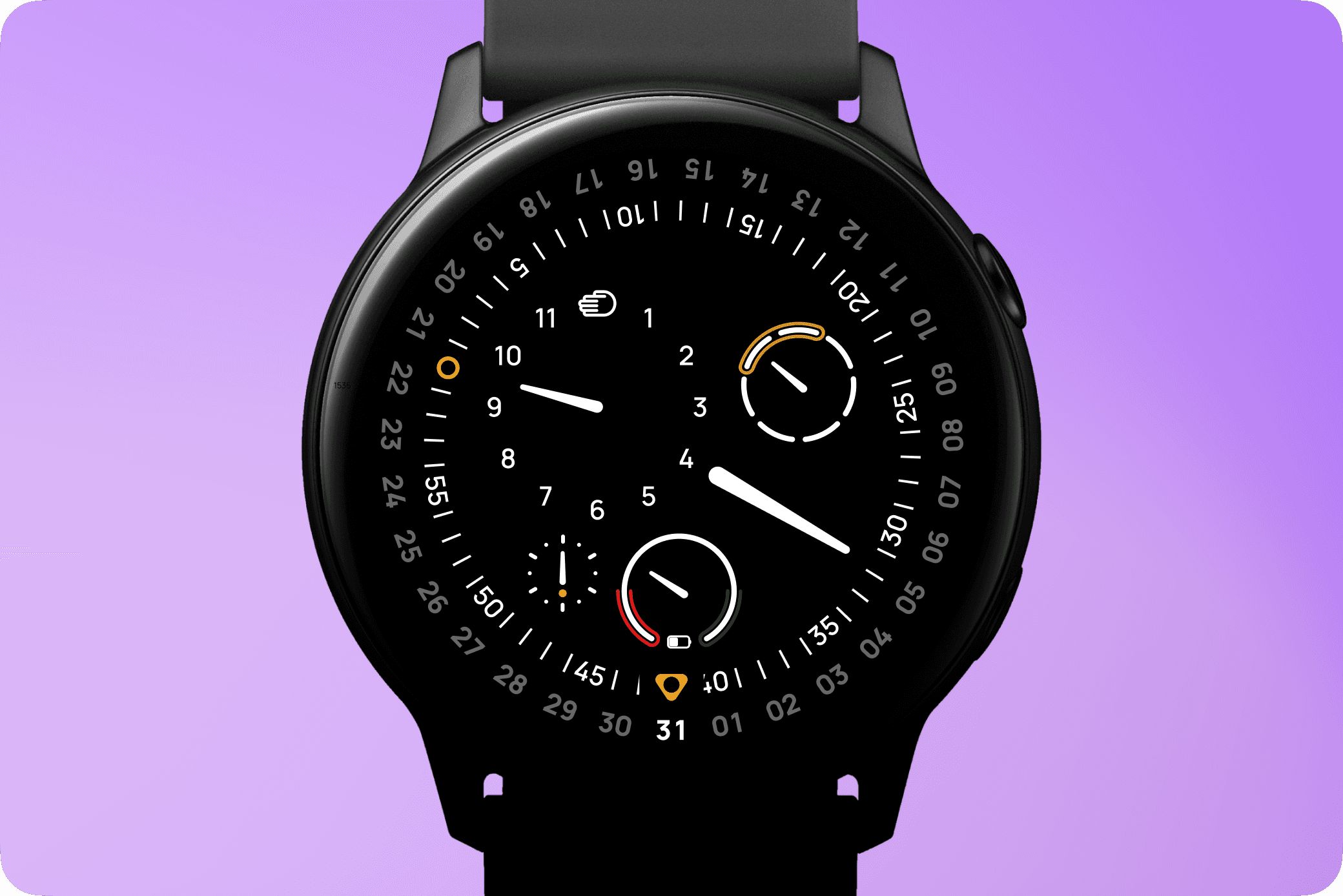
That love for watches never faded. Over the years, I discovered timepieces that weren’t just tools but works of art. And then one day, I got a Samsung Galaxy Watch. Suddenly, I had a single device that could be any watch I wanted it to be. That idea was powerful.


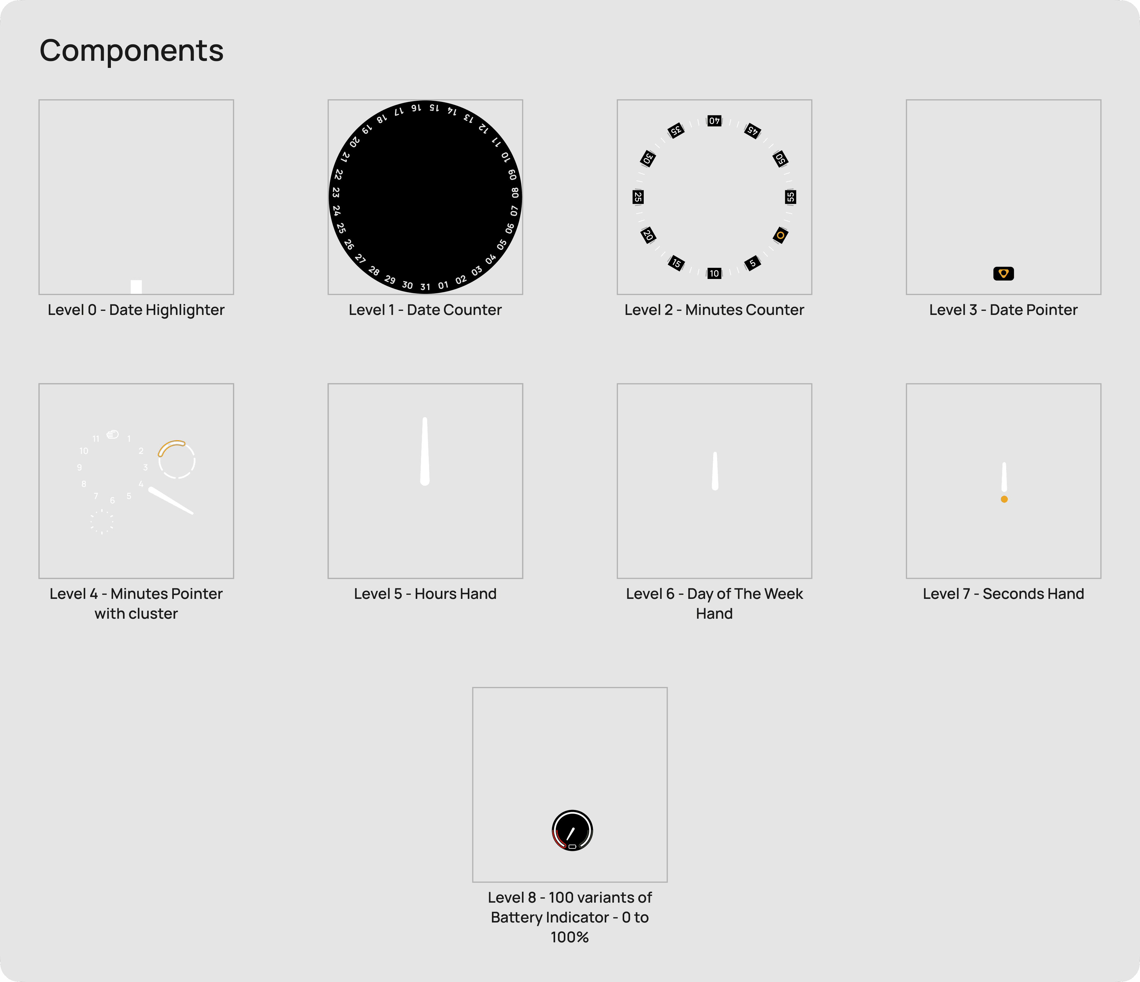
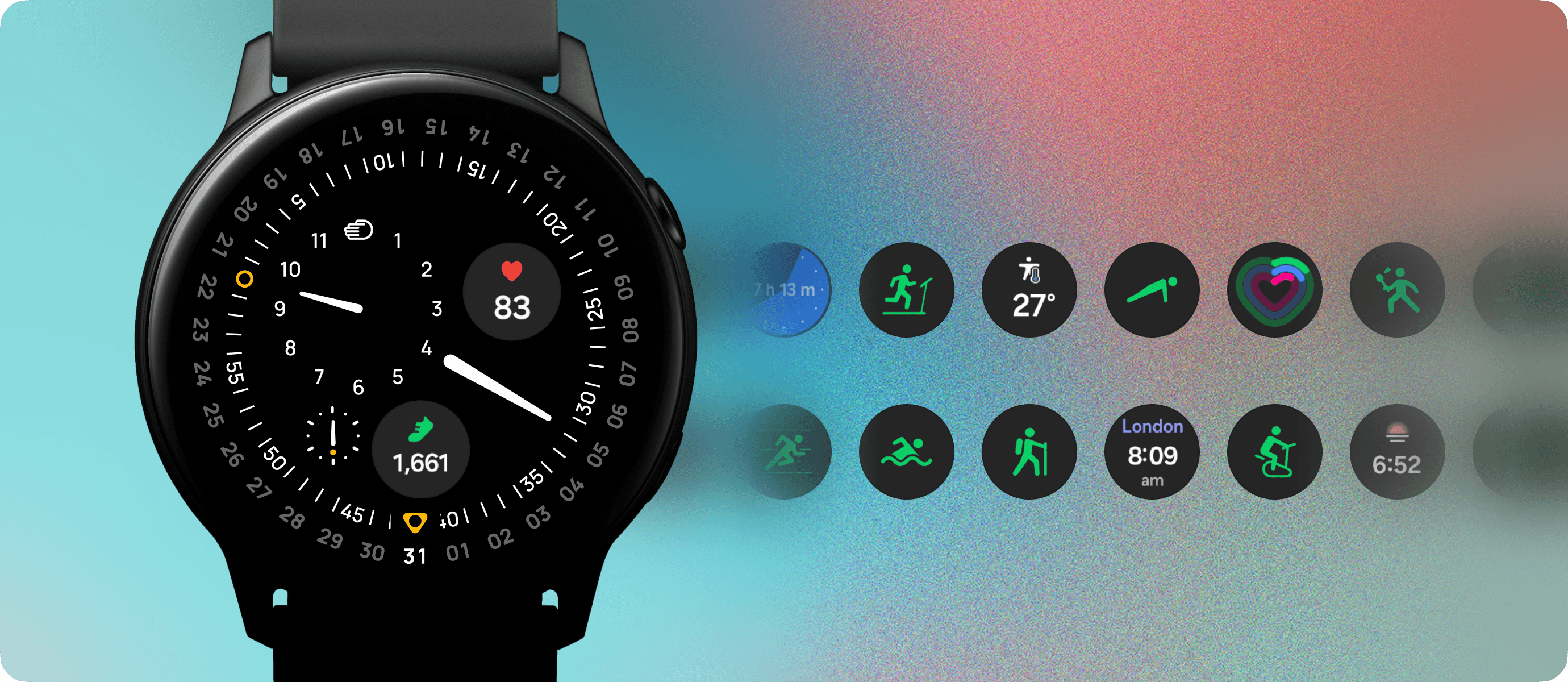
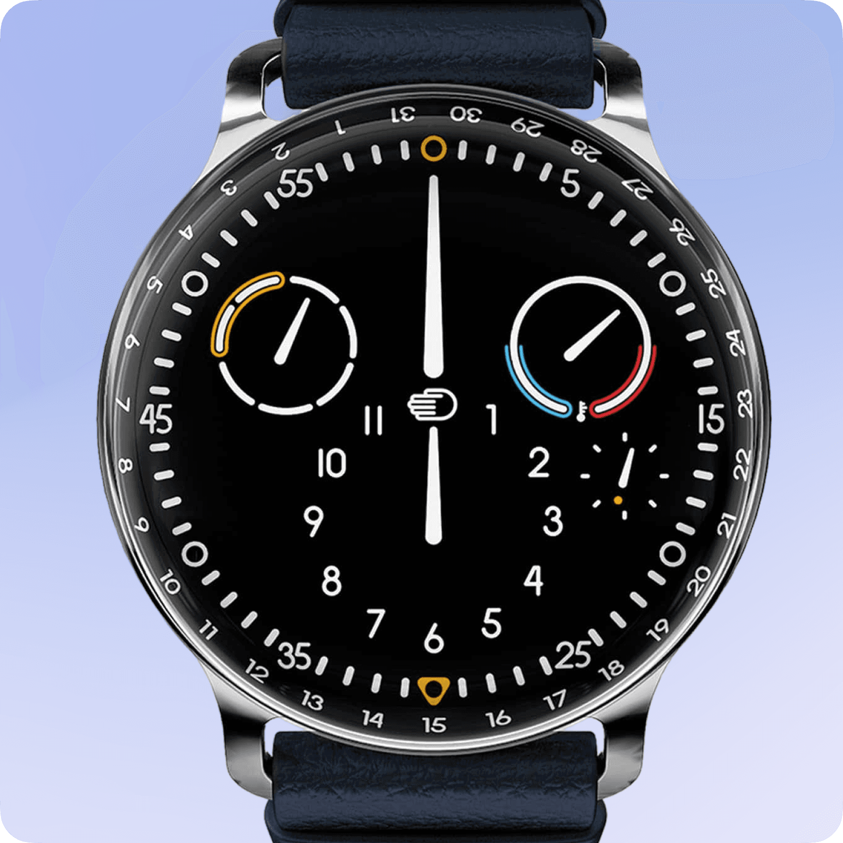
But here’s the thing—it didn’t have my watch. The one I’d always admired. So, I decided to build it. I studied the details, the movement, the way it felt. I designed it. I developed it. I brought it to life. And just like that, I wasn’t just wearing a smartwatch anymore. I was wearing my watch.

DESIGNING & BUILDING THE WATCH FACE

Bringing the Ressence Type 3 into the digital world wasn’t just about copying its look—it was about understanding its mechanics and translating them into an interactive smartwatch experience. Here’s how I did it:

  1. Breaking Down the Watch – Studied the Type 3’s mechanics, deconstructing its floating dial into static and dynamic layers.

  1. Designing in Figma – Recreated each layer from scratch as individual components, ensuring precision before exporting them as PNGs.

  1. Building in Watch Face Studio – Assembled layers in the correct order to maintain depth, movement, and visual accuracy.

  1. Programming Interactions – Defined logic for smooth rotations, real-time updates, and an experience that stays true to the original.

This wasn’t just about making a watch face—it was about capturing the essence of a mechanical masterpiece and reimagining it for a digital age.

CHALLENGES & ITERATIONS

Turning a mechanical watch into a digital experience is never a one-to-one transition—especially when the watch in question is the Ressence Type 3. Unlike traditional watches, it doesn’t have hands. Instead, the entire dial rotates as a whole, with each sub-dial maintaining its synchronized movement—like planets orbiting a central axis.

Full Rotational Movement

The entire dial rotates, maintaining the planetary motion of the original mechanical watch.

Adjusted for Feasibility

Due to tool limitations, I fixed the minute hand while making the minute numbers rotate instead, ensuring functionality without losing the essence of the design.

CHALLENGES 1: TOOL LIMITATIONS

The tool I was using to develop the watch face couldn’t support this complex movement. I had to rethink the approach—how do I keep the essence of the design while staying within the tool’s limitations?

THE SOLUTION?

Since the tool I was using couldn’t replicate this full rotation, I took an alternative approach: I fixed the minute hand in place and instead made the minute numbers rotate around it. This preserved the watch’s signature planetary style while ensuring legibility at a glance.


PS: I’m still experimenting with ways to achieve the full movement, pushing the tool’s limits to bring the original experience to life.

CHALLENGES 1: OPTIMIZING PERFORMANCE WITHOUT SACRIFICING SMOOTHNESS

The tool required all watch face assets to be designed externally and imported as PNGs or JPGs. While hands could be a single asset programmed to rotate based on time, the battery indicator had to be handled differently. Instead of dynamically updating a single asset, I had to pre-render images for each battery level.


To ensure a smooth transition, I chose to create 100 images (each representing a 1% increment) rather than just 10 images (every 10%). But this decision led to performance issues

VERSION 1: THE PROBLEM

The first version had a detailed battery dial along with other static elements, meaning the watch had to handle 100 high-resolution images at all times. Every time the user returned to the watch face, it had to process and render all these layers, slowing performance.

VERSION 2: REDUCING LAYER LOAD

To optimize, I made two key improvements:

  1. Removed unnecessary background layers – The battery dial originally had its own background, but since a background already existed on a lower layer, I made this one transparent.

  1. Enabled conditional rendering – Instead of the system searching for and displaying an image at every battery level change, I used the tool’s feature to only load the necessary image at that moment. This reduced processing time and power consumption.

VERSION 3: OPTIMIZING WHAT GETS RENDERED

At this point, battery percentage still triggered the entire dial’s refresh. So, I took it a step further:

  1. Separated battery elements from other static parts – This meant only the battery level dial updated, not the entire watch face.

  1. Minimized details in the battery layer – Less complexity meant faster rendering and less strain on the watch’s processor.

These optimizations allowed me to retain smooth 1% increments while improving performance, reducing battery drain, and ensuring a seamless user experience.

ADAPTING THE TYPE 3 FOR A SMART WATCH

Recreating the Ressence Type 3 for a digital watch wasn’t just about copying its design—I wanted to make subtle changes that made sense for a smartwatch while staying true to its essence. Here’s what I tweaked:

Adjusting the Runner Dial: From 6 Minutes to 60 Seconds

The original runner dial took 6 minutes per rotation, which felt frozen in testing. I sped it up to 60 seconds, doubling as a functional seconds hand.

Enhancing the Date Dial for Better Readability

On the Type 3, the date sits at the edge of the domed dial for easy angled reading. On flat screens, this hurt readability. User testing confirmed it, so I highlighted only today’s date and dimmed the rest for clarity.

Replacing the Temperature Gauge with a Battery Indicator

The original Type 3 has a temperature gauge to monitor oil expansion. Since digital watches don’t use oil, I replaced it with a battery indicator—crucial for managing daily charging.

These small adjustments bring practicality to a digital version without losing the magic of the original design. The result? A watch face that feels both familiar and functional on a smartwatch.

Once I had successfully brought the beautiful Ressence Type 3 watch face to the digital world, I started thinking—could I also introduce customization, like other smartwatch faces have? But I didn’t want it to be wild—no flashy colors, no over-the-top tweaks that would take away from its essence. The Type 3 is a mechanical marvel, and any customization had to respect that.

That’s when I saw the perfect opportunity. The battery indicator and day-of-the-week display—essential but fixed in place—could become something more. What if users could swap them for information that truly mattered to them? A heart rate monitor, step counter, or even a compass for their next journey. And then I thought, why stop there? What if these elements weren’t just displays but interactive buttons—one tap to start a run, a hike, or a cycling session?

So, instead of just mimicking the Type 3, I made it evolve—keeping its spirit intact while giving it a touch of smart, meaningful customization.

Type 3 by Ressence

Type 3 Digital Version by me

Learnings from This Project

Bringing the Ressence Type 3 to a digital smartwatch was more than just a design challenge—it was an opportunity to rethink how a mechanical marvel could adapt to a new medium. Along the way, I gained valuable insights:

Customization Should Be Meaningful – Instead of arbitrary customizations, I introduced smart, useful changes—allowing users to swap the battery and day indicators for relevant data or quick actions, keeping the watch face personal yet true to its original intent.

Performance Optimization is Key – Balancing high visual fidelity with smooth performance required strategic asset management, from reducing layers to using conditional rendering, ensuring a seamless experience without overloading the system.

Technical Constraints Lead to Creative Solutions – The tool limitations forced me to rethink movement, leading to the minute numbers rotating instead of the entire dial—a workaround that preserved the watch’s essence while ensuring it functioned smoothly.

User Testing Uncovers What You Don’t Expect – The slow runner dial made users feel the watch was stuck, which led to speeding it up to 60 seconds per rotation, making the watch feel more alive while also serving as a functional seconds dial.

This project reinforced the idea that designing for a new platform isn’t about replication—it’s about evolution.

Close