

INTRODUCTION
Mio provides soundproof pods in bustling spaces like malls and airports—giving you a quiet, private spot for calls, meetings, or a moment of focus amidst the chaos.
Project type:
PWA to book POD’s, Admin panel, Responsive website, Promotional material
My contribution:
Visual & Interaction design, User Journey, Information architecture, Prototyping, Usability testing, Client handling
Timeline:
3 months
Team size:
1 Designer, 2 Backend, 2 Frontend, 1 Project manager
Introduction
Problem Statement
Discover Problem
Research and Insights
The solution
Impact & Conclusion
Testimonial

Problem
Statement
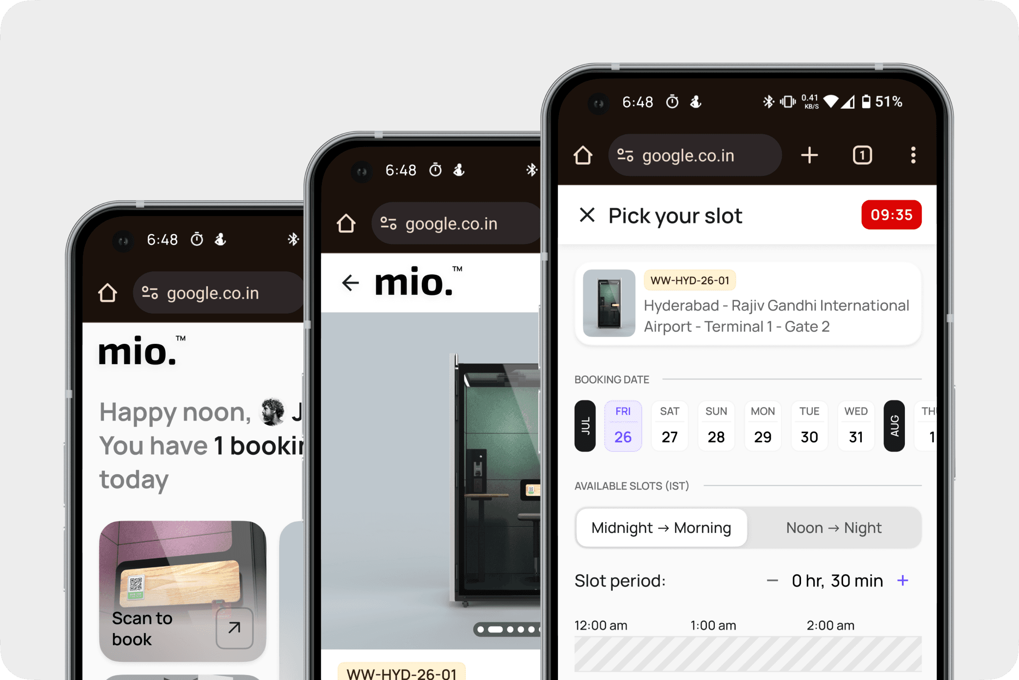
The app’s rigid 30-minute slot system didn’t support on-demand bookings, preventing users from accessing available PODs in real time. This not only led to poor user experience but also resulted in significant revenue loss from unbooked yet in-demand time slots.
Discover
Problem
I watched users walk up to our PODs, ready to work—but the system told them “no.” Not because the space was full, but because it didn’t start on a neat 30-minute line. It was a flaw in logic, not in demand. People were there. Time was available. But the design got in the way. That’s when I realized—we weren’t just losing bookings; we were losing moments that mattered.
Research and Insights
To dive deeper, I explored other products in adjacent domains—like event booking, meeting scheduling apps, and others—to see how they handled similar scenarios.
Event booking apps had fixed start times (like a show at 1 PM), but in offline settings, ticket counters often stayed open briefly after the event began—and people were fine entering slightly late or early if they understood what to expect.
Meeting and calendar apps (e.g., Google Calendar or Meet) were much more flexible—letting users start or join anytime, even mid-slot.
I also looked at a turf-booking app. While it followed rigid slot rules, its slot selection flow was well-designed—intuitive and visually clear—which inspired ideas on improving the booking experience even within system constraints.


From this exploration and user interaction, I gathered two key insights:
Users don’t mind starting slightly late or early if there’s clarity.
The 30-minute minimum use case still made sense for our audience—there was no need to break it down into smaller 10- or 15-minute slots.
These insights helped shape a direction that could preserve system integrity and improve user experience.
The solution
We redesigned the booking flow with two goals:
Make booking feel real-time and flexible.
Ensure users always got a fair usage window (30 minutes minimum window).


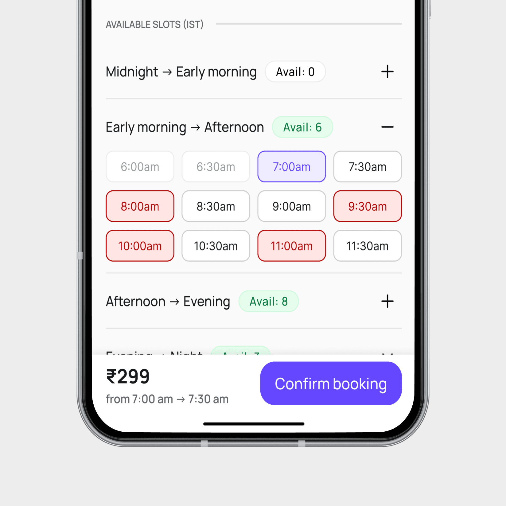
To support flexible timing, we also adjusted the slot logic. For example:
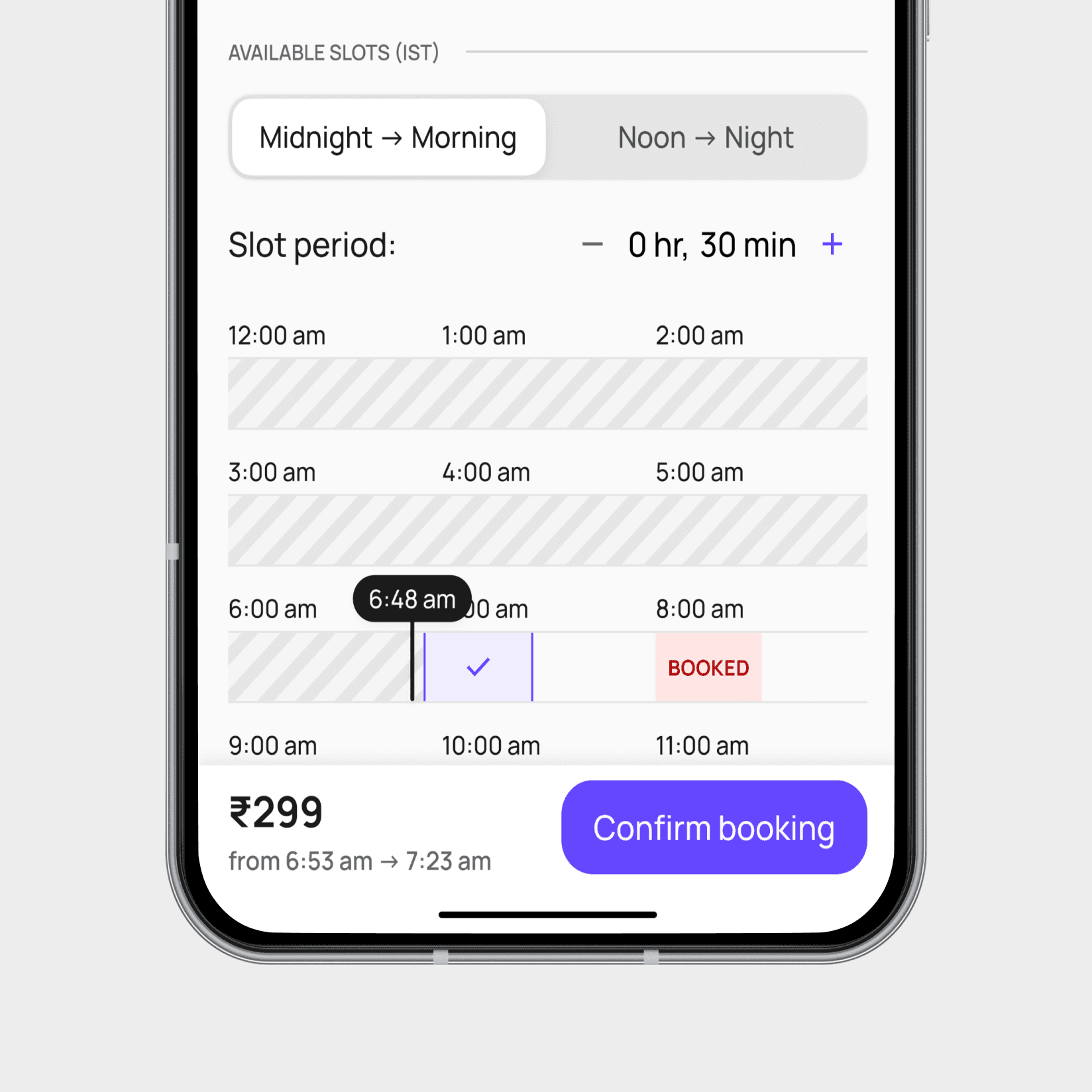
I shifted from thinking in blocks to thinking in time strips — where the timeline continuously flows, and the current time becomes the reference point. We used the existing 10-minute booking window and broke it internally into two hidden 5-minute zones, which the user never saw directly.
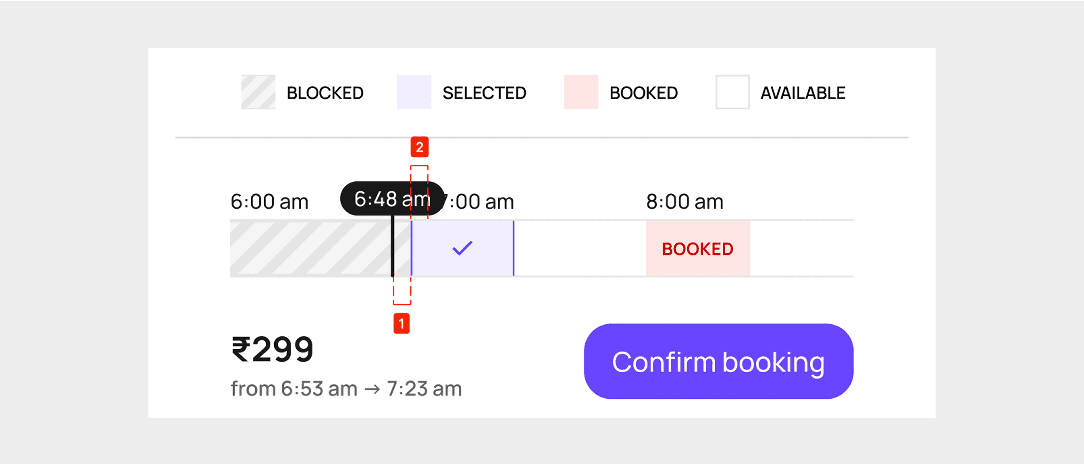
If a user started booking at 6:48 am for 30 min, they get slot for 6:53 am -> 7:23 am having 5 minutes as buffer to complete the booking process (shown as ① in the image)
The second 5 minutes came from the user’s own selected slot (② in the image). This gave them a total of 10 minutes to confirm the booking
If they did it quickly — say in 3 minutes — they were rewarded with up to 2 bonus minutes, allowing up to 32 minutes of pod time. This small incentive encouraged users to act faster, improving overall slot turnover.
But If the user exceeded the initial 5-minute buffer, they were informed that booking time was now being deducted from their selected slot. They could either continue with slightly reduced time or pick a new slot to get the full 30 minutes.
To maintain a minimum booking duration, we set a 5-minute cap beyond the buffer. If the user didn’t complete the booking within that window, the session expired, and they were required to start over. This ensured a fair and consistent experience for all users.

Impact &
Conclusion
By rethinking how time slots functioned, we unlocked a more flexible and user-friendly booking experience. Users were no longer constrained by rigid 30-minute blocks—they could now start bookings at any time, even as specific as 6:48 AM, without disrupting the system. This shift respected real-time availability, increased slot utilization, and rewarded efficiency, all while keeping the interface simple and intuitive.
Before
After
The buffer-based logic and subtle reward system not only reduced booking friction but also encouraged faster decisions, preventing slot hoarding and waste. Behind the scenes, a smarter time strip logic replaced static slot blocks—resulting in a seamless, on-the-go experience that better aligned with how users actually needed to access the PODs.
Testimonial
“I'd love to mention about Harsh's contribution on some of our ongoing projects. With an enthusiastic and will-do-it attitude, his incredible understanding of product workflows and use-case scenarios gave a perfect UI-UX start to the equally fantastic tech team in creating one of the most innovative
applications we will be launching soon. Happy to see him demonstrate (and naturally so) stakeholder management, attention to detail and a keen appetite to learn. All the very best Harsh as you scale through your design career ahead.”

Vikas Sethia
Startup Founder @PrivacyPods @HRTech

Close